
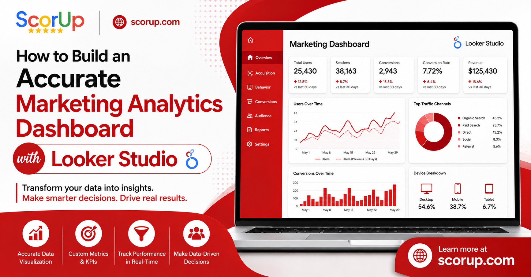
In today’s fast-paced digital world, making decisions based on data is not just helpful—it’s a must for growing a business. Every marketing effort, like website visits, ad performance, and customer interactions, provides useful information. But with so much data coming from different tools, it can be hard to keep track. That’s why having a single place to collect and understand all this information is important. A Marketing Analytics Dashboard gives companies a clear view of important performance measures, helps track how well campaigns are working, and allows for smarter choices all in one place. Instead of checking Google Analytics 4, Google Ads, Meta Ads, Search Console, and CRM systems separately, marketers can bring all their data together in one easy-to-use dashboard. This saves time, makes reporting more accurate, and helps plan marketing strategies better.
Google Looker Studio is a top choice for creating custom marketing dashboards. It has strong tools for showing data visually, works smoothly with Google services, and is easy to use for people of all experience levels. Whether you run an online store, a software company, or a digital marketing firm, a well-organized dashboard helps you see how things are going in real time and make better campaign choices. In this guide, you’ll learn how to create a reliable dashboard using Looker Studio, which metrics to include, and how to keep your reports accurate. By following these steps, you can turn raw numbers into useful knowledge that helps make better business decisions.
What Is a Marketing Analytics Dashboard?
A Marketing Analytics Dashboard is a single place where data from different marketing tools is collected and shown in an easy-to-read visual format.
Instead of looking through separate reports from different platforms, businesses can check all important numbers in one spot.
A well-made dashboard usually has:
- Website traffic
- User behaviour
- Conversion tracking
- Ad performance
- Lead generation
- Revenue metrics
- Search engine rankings
- Customer acquisition data
With interactive charts, scorecards, tables, and filters, users can look at performance from different angles without creating reports manually.
Why Businesses Need a Marketing Analytics Dashboard
Marketing decisions should be based on real data, not just guesses.
When you don’t have a consistent way to track performance, it’s hard to see which campaigns are working and which need help.
Using a Marketing Analytics Dashboard offers several benefits:
Better Decision-Making
Having real-time access to marketing data helps teams respond quickly to changes in campaign performance.
Improved Reporting Efficiency
Automated dashboards take away the need for time-consuming spreadsheet updates and lower the chance of report mistakes.
Higher ROI
Understanding which marketing channels give the best returns lets businesses spend their budgets more wisely.
Stronger Team Collaboration
When everyone uses the same dashboard, marketing, sales, and management teams can all work with the same performance data.
Why Choose Looker Studio?
Google Looker Studio is one of the most powerful, free tools for creating professional dashboards without needing advanced coding skills.
Some of its key benefits include:
- Free to use
- Interactive data visuals
- Real-time reporting
- Custom dashboards
- Easy sharing and teamwork
- Works with many data sources
- Accessible from the cloud
Looker Studio is especially useful for businesses that already use Google services since it connects smoothly with Google Analytics 4, Google Ads, Search Console, BigQuery, and Google Sheets.
Essential Metrics to Include
The success of any dashboard depends on choosing the right key performance indicators (KPIs). Adding too many metrics can make reports confusing, while adding too few might miss important information.
Some of the most important metrics are:
Website Performance
- Users
- Sessions
- New users
- Engagement rate
- Average engagement time
Traffic Sources
- Organic Search
- Paid Search
- Direct Traffic
- Social Media
- Referral Traffic
- Email Marketing
Conversion Metrics
- Leads generated
- Purchases
- Conversion rate
- Revenue
- Cost per acquisition (CPA)
Advertising Performance
- Impressions
- Clicks
- Click-through rate (CTR)
- Cost per click (CPC)
- Return on ad spend (ROAS)
Choosing metrics that match your business goals keeps the dashboard clear, useful, and easy to understand.
Connecting Your Data Sources
One of the biggest benefits of Looker Studio is its ability to bring data from different platforms together into one report. Instead of checking separate dashboards for each marketing tool, you can create a single view of your business performance.
A full Marketing Analytics Dashboard usually includes data from:
- Google Analytics 4
- Google Ads
- Google Search Console
- Google Sheets
- BigQuery
- Meta Ads (via connectors)
- CRM platforms
- Email marketing tools
- E-commerce platforms
Putting these sources together helps you compare how different channels are performing, understand customer paths, and find out which marketing activities bring the best return on investment.
Designing an Effective Dashboard
A dashboard should do more than show numbers—it should explain what the data means. Organizing information in a logical way makes reports easier to understand and helps people focus on the most important metrics.
Create an Executive Summary
Start the dashboard with key performance indicators (KPIs) like:
- Total Users
- Total Leads
- Revenue
- Conversion Rate
- Cost Per Acquisition
- Return on Ad Spend
This part gives decision-makers a quick look at overall performance.
Organize by Marketing Channel
Split data into clear sections, such as:
- Website Performance
- Organic Search
- Paid Advertising
- Social Media
- Email Marketing
- Sales Performance
This setup makes it easier to navigate through the dashboard.
Dashboard Visualization Best Practices
Picking the right way to show data helps people read and understand it better.
Recommended chart types include:
Scorecards
Great for showing KPIs like revenue, users, and conversions.
Line Charts
Useful for seeing trends over time, like daily traffic or monthly revenue.
Bar Charts
Good for comparing campaigns or marketing channels.
Pie Charts
Best for showing how traffic comes from different sources.
Tables
Helpful for listing keyword rankings, campaign results, or landing page data.
A good Marketing Analytics Dashboard uses visuals smartly without overwhelming users with too much information.
Custom Filters and Date Controls
Interactive dashboards offer more options than static reports.
Useful filters include:
- Date range
- Marketing channel
- Device type
- Country
- Campaign
- Landing page
- Source/Medium
These filters let users look at performance from different angles without making new reports.
Keeping Data Accurate
Even the best-looking dashboard isn’t useful if the data is wrong.
Follow these best practices:
- Check all data sources regularly.
- Set up Google Analytics 4 properly.
- Use the same UTM parameters consistently.
- Enable conversion tracking.
- Remove duplicate events.
- Check the health of connectors.
- Test calculations before publishing reports.
A dependable Marketing Analytics Dashboard builds on clean, trusted data that accurately shows how the business is doing.
Common Dashboard Sections
A professional dashboard should have separate sections for each major area of digital marketing.
Website Overview
Keep an eye on:
- Users
- Sessions
- Bounce rate
- Engagement rate
- Average session duration
SEO Performance
Track:
- Organic users
- Top landing pages
- Search impressions
- Clicks
- Average keyword positions
Paid Advertising
Measure:
- Campaign spend
- Clicks
- CPC
- CTR
- Conversions
- ROAS
Lead Generation
Review:
- Total leads
- Qualified leads
- Lead conversion rate
- Cost per lead
Sales & Revenue
Show:
- Orders
- Revenue
- Average order value
- Customer acquisition cost
This structure ensures everyone can quickly find the insights that matter most to their role.
Step-by-Step Guide to Building Your Dashboard
Creating an effective dashboard is more than just linking data sources.
A structured approach makes sure your reports are accurate, easy to understand, and useful for making smart choices.
Step 1: Define Your Objectives
Before you start using Looker Studio, think about what you want to measure.
Your dashboard should help answer specific business questions, like:
- Which marketing channels bring in the most leads?
- Which campaigns give the best return on investment?
- How is website traffic changing over time?
- What factors affect conversion rates?
Having clear goals helps you focus on important KPIs and avoid showing unnecessary data.
Step 2: Connect Reliable Data Sources
Link trusted platforms such as Google Analytics 4, Google Ads, Search Console, CRM systems, and other marketing tools.
Make sure each data source is set up properly and stays updated to keep your reports accurate.
Step 3: Build a Clear Layout
Arrange your dashboard into logical sections.
Place key KPIs at the top, followed by reports for each channel and detailed performance data. A clean layout makes it easier to navigate and helps people find the information they need quickly.
Step 4: Add Interactive Features
Use filters, date pickers, and drill-down options so users can look at data from different angles.
Interactive dashboards are more useful than fixed reports because they offer flexibility without needing multiple versions.
Step 5: Test Before Sharing
Check every chart, calculation, and filter to make sure the data matches your original sources.
Testing helps find errors and ensures decision-makers can trust the insights shown.
Common Mistakes to Avoid
Even experienced marketers can make dashboards hard to read or hard to maintain.
Avoid these mistakes:
- Adding too many metrics on one page
- Using inconsistent time frames
- Not thinking about how the dashboard looks on mobile devices
- Missing data accuracy checks
- Using too many colours and visual elements
- Not tracking business goals or conversions
- Forgetting to update your connected data sources
A successful Marketing Analytics Dashboard should stay simple, focused, and connected to business goals rather than trying to show all possible metrics.
Tips for Long-Term Dashboard Success
To keep your reports useful over time, follow these tips:
- Review KPIs each month.
- Remove charts that are no longer needed.
- Update calculations when business goals change.
- Use standard names for campaigns.
- Do regular checks for data quality.
- Train your team on how to read the reports.
A well-maintained Marketing Analytics Dashboard becomes a key tool that supports improvements in all marketing efforts.
Why Choose Scorup?
At scorup.com, we help businesses turn raw marketing data into useful insights.
Our team is skilled at creating custom analytics solutions that improve data accuracy, campaign performance, and decision-making.
Our expertise includes:
- Looker Studio Dashboard Development
- Google Analytics 4 Setup
- Google Tag Manager Setup
- Conversion Tracking
- Server-Side Tracking
- Google Ads Management
- SEO Performance Reporting
- Marketing Analytics Consulting
Whether you are a start up, agency, or large business, we design dashboards that fit your goals, so you can track performance with confidence and make smarter marketing choices.
Conclusion
Creating an accurate dashboard is one of the smartest investments a business can make in today’s data-driven world. Instead of using separate reports or manual spreadsheets, companies can use Looker Studio to bring all marketing data together, improve reporting efficiency, and get real-time insights.
A professionally designed Marketing Analytics Dashboard helps businesses understand how customers behave, measure campaign success, manage marketing budgets, and find new growth opportunities. By combining data from many platforms into one simple interface, decision-makers can respond quickly to market changes and make better strategic decisions.
As digital marketing becomes more complex, businesses that focus on accurate reporting gain a strong competitive edge. Investing in a dependable Marketing Analytics Dashboard allows teams to spend less time gathering data and more time using insights to drive real business growth.
If you’re looking to build powerful dashboards that deliver useful insights, scorup.com offers the expertise, technical skills, and ongoing support needed to help your business succeed.